The internet has everything and everything ranging from tons of information on whatever you can think of to numerous other things like memes, social media or even online shopping. Here you can say or post almost anything. This is a good and bad thing. You can say whatever you want but you have to be careful or else this will bite you in the ass later because whatever is posted on the internet stays on the internet.
When it comes to copyright I believe its a good idea but it’s very hard to keep up with. It does help keeps the owner’s work safe from plagiarism but sometimes it gets out of hand. For instance did you know happy birthday is copyrighted?! Restaurants can’t even sing you happy birthday without the chance of being sued, which is why I think copyright should be weakened a bit.
If I were to choose a license for my work I would leave it as a public domain. I would honestly be flattered if someone liked my work so much that they copied it or posted about it.
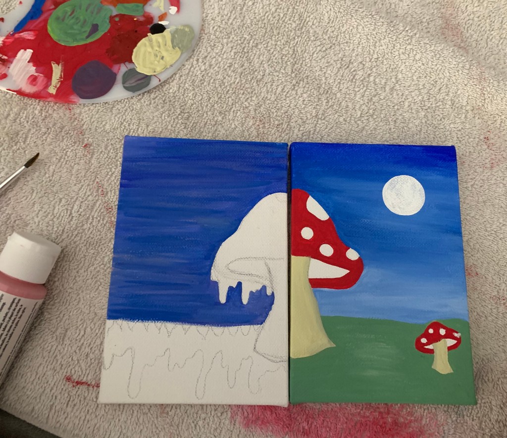
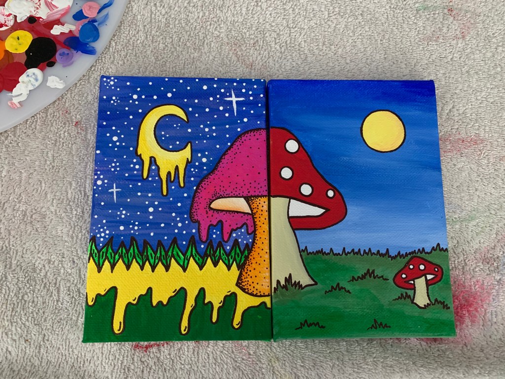
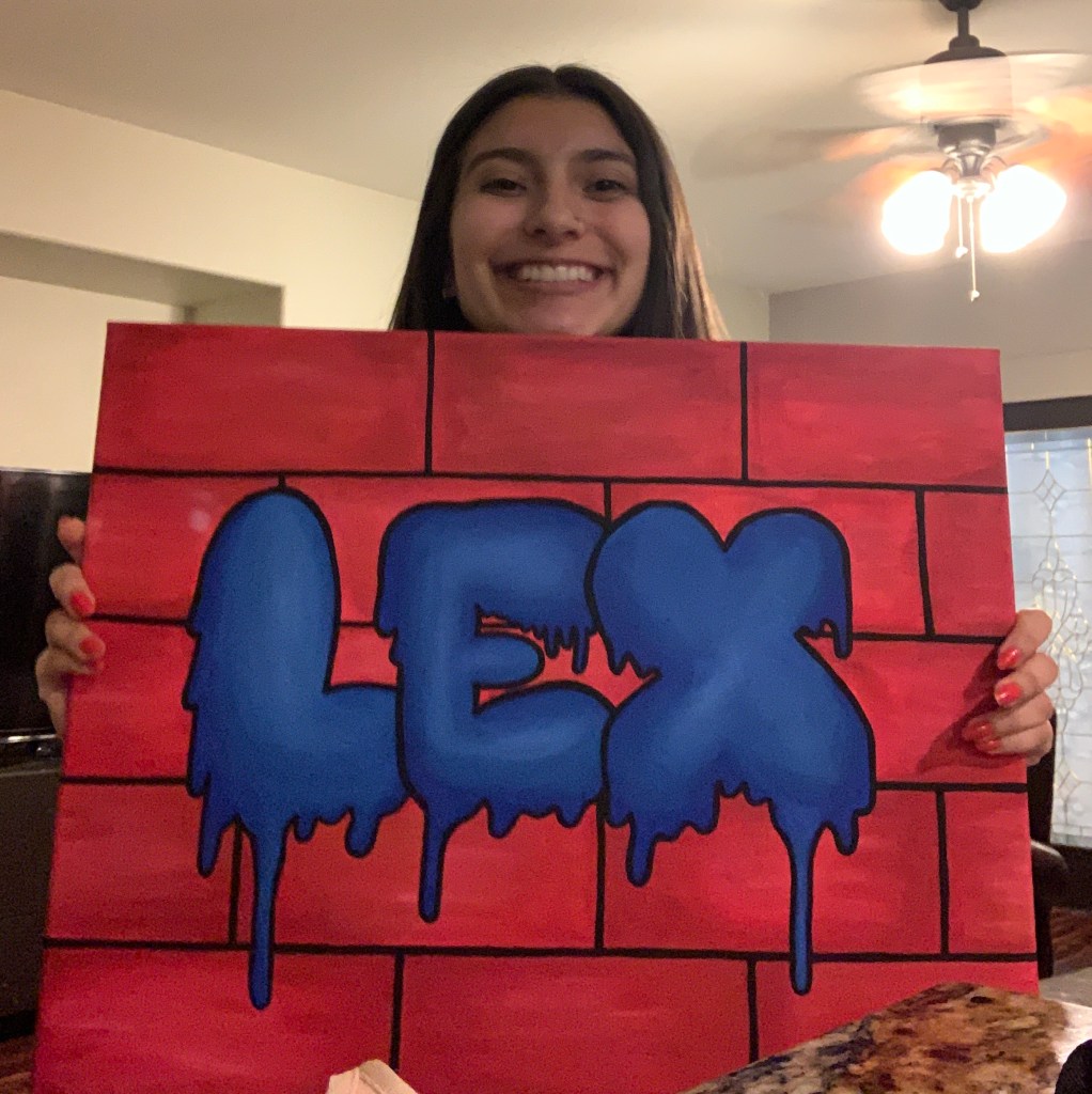
All in all I had a great time painting this piece. I really enjoyed how I “remixed” the neon trippy art style with the more classic cartoon. The piece didn’t turn out as I originally expected though. I assumed the neon colors to be much brighter and easier to use. Not only that but the colors to blend much better. Overall I enjoyed this assignment a lot.
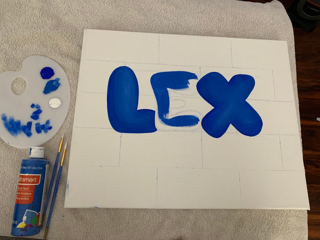
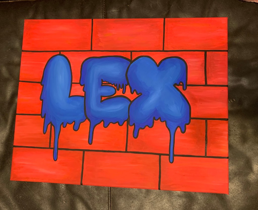
This week’s activity was inspired by the world of graffiti. We were assigned to draw or paint our names in a graffiti like style and when I heard about this assignment I honestly got really excited. Graffiti has always been a medium/art style I have always wanted to experience. The big blocky lettering contrasting with the dull brick/wall just looks so amazing to me. And even though I painted this weeks assignment with a paint brush I do want to actually experience Graffiti with spray paint.
Me with my work 😛
But although I didn’t get to experience actual graffiti I was pleasantly surprised and happy with my piece. If you know me personally you will know that I love drawing and painting in big blocky/ graffiti inspired fonts, for instance the dripping font as shown in the piece. I genuinely enjoy the look of the bright bold color with the black outline on a plain wall. I also enjoy experimenting with different fonts including the drips to make it look more lifelike and 3D, which is why I did some shading with the blues in the font and the reds in the background.
All in all this week’s assignment has probably been my favorite so far. Painting this piece has really reminded me how much I loved art. Painting is so peaceful and stress relieving. And as I was painting this it felt like all my problems with work, school or my family just went away. Which is why after finals I will probably take up painting again as well as take more art classes in the future because it makes me happy even though I was discouraged from going to art school. Hopefully I can take more with Professor Zucman as well.
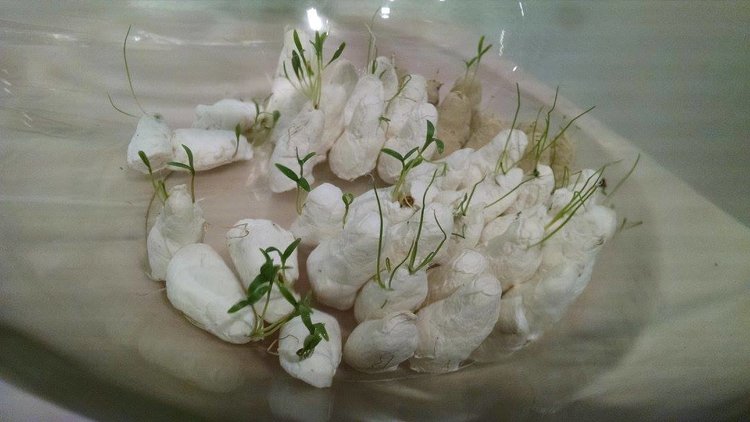
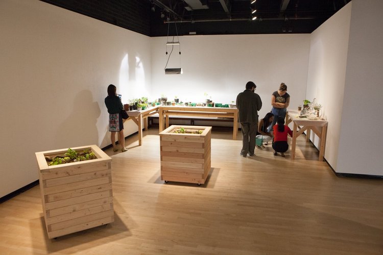
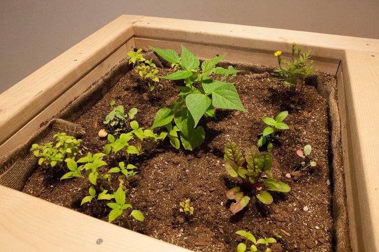
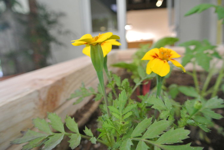
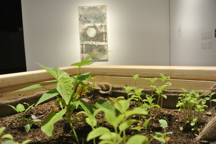
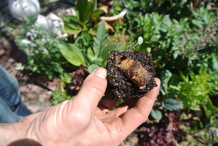
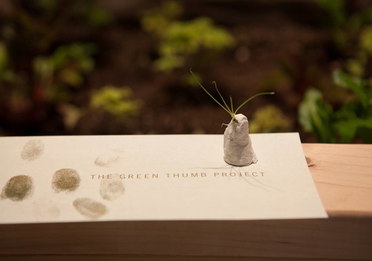
Media: six raised-bed planters, two tables that displayed plants in various stages of growth, accompanied by a faint audio recording of my voice describing the growth of the sprouts, one table that functioned as a paper-casting station, and a collaged printed work. The paper-casting station hosted an assortment of seed packets and a large glass container holding multiple sprouting paper-casted thumbs.
Kiyomi Fukui is a Japanese- American artist who works and resides in Long Beach, California. She received her Bachelor of Fine Arts in Graphic Design form La Sierra University and her Master of Fine Arts in print making from CSU Long Beach. She also does a lot of print based work as well as participatory performance, for instance fiber arts like tatting or crocheting.
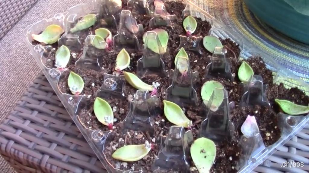
In her exhibit, the Green thumb project, she does an amazing job of turning simple plants and gardening into a complete art piece with meaning. For instance, she uses paper castings of thumbs and sprouts seeds out of them as well as displays the progress of their growth. Not only that but her gallery’s display was so monotone and simplistic yet if felt like it was complete at the same time. It gave great emphasis on the plants. Additionally, the muted earth tones compared with the white just gave the whole display a contrast and great balance as well.
Kiyomi is typically interested in things that are intangible and impermanent, like emotion or memories. And with this piece the whole project was inspired by a moment with her mother. Before her mother’s passing she created a mold of her thumb and that mold inspired her use of the paper castings where all the seeds sprout from. All in all I think that meaning is beautiful, especially how she used her personal loss to inspire a universal message within her work.
Honestly this piece has been very touching and heartfelt. Her inspiration from her departed mother has been very eyeopening to me. It has motivated myself to enjoy these moments with my loved ones a little more and to not hold on to them because all in all these are all intangible and impermanent things. We can’t hold onto or dwell on all these memories forever. And Kiyomi created a piece inspired by the touching moments instead of dwelling on what was which I genuinely admire a lot. I conclusion Kiyomi is an amazing artist and her pieces are both beautiful visually and emotionally.
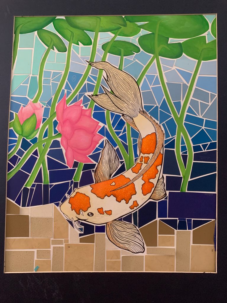
The purpose of this weeks activity was to make aware of the topic, how we use expensive, toxic, and non-biodegradable materials for our artwork. The problem with this is that most of these materials end up in landfills, so to solve this problem our assignment was to make an artwork that potentially can last forever.
My idea was to make a mosaic like piece using the excess paint chips we had stored when we painted my little sister’s room a few years ago. And when I think of mosaics I thinks of peacefulness or tranquility which is why I used a koi fish as my center.
The materials I used for this piece were a variety of blue and tan paint chips, acrylic paint, watercolor, pen, glue and sharpie.
I do believe my piece was able to express my idea because I think the piece as a whole looks great and its very calming with the pastel colors compared to the gradient mosaic of the background.
Being honest, my choice of materials has made me not want to work with small pieces of paper and glue ever again (>_<). It was a very tedious and annoying process because I have little patience how it is and I was limited on the paint chips I had so every piece counted. But there was a huge payoff because I think the piece turned out looking beautifully, so there’s a chance I might make another mosaic in the future.
I believe a kiss should last 5-10 seconds, a great meal should last an hour, a work off art should last forever, a marriage should last “til death due us part”, and a human life should last as long as one is content with their experiences in life.
I believe ephemeral art and human lives do make a difference in the way we experience them. I believe this because we cherish our time with them more due to the thought of us not being able to experience them again. For instance one looks back on all the good times they spent with a relative that passed away.
I also believe most things should be sustainable like clean water, air and land because everyone has a right to experience them. No matter if one is 80 or 8 months.
And yes I do believe one person can make a difference in a global problem like climate change. That one person can bring awareness to the issue and influence solutions to help our planet before every beautiful thing is taken away from us.
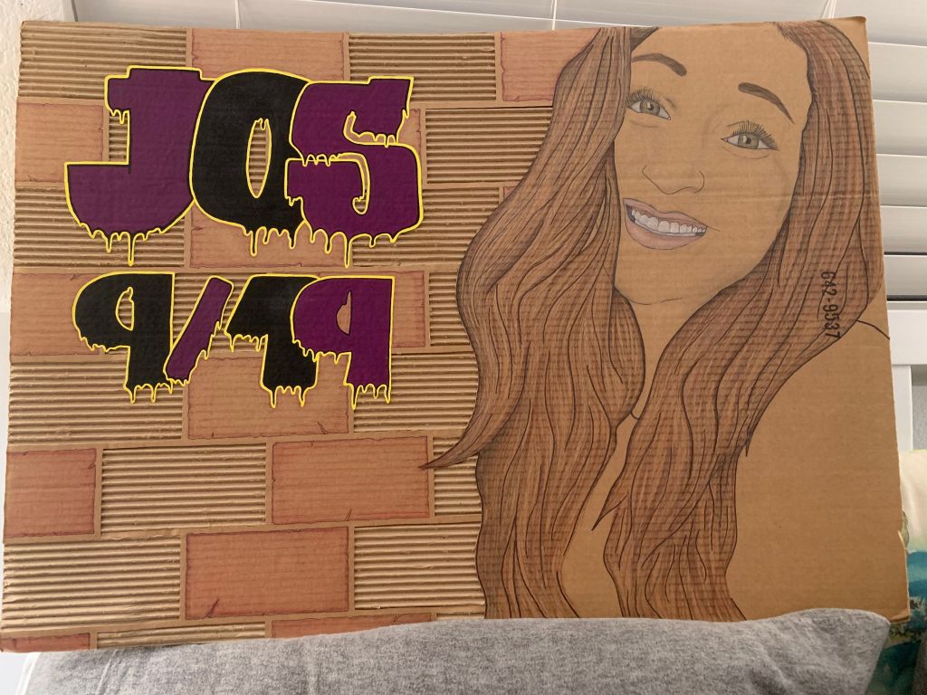
Not only that but making sustainable art has been inspiring to me for some time now. For instance, here is another artwork I created two years ago using cardboard, an exact knife, acrylic paint and colored pencils. This is a self portrait of my cousin who passed away almost 5 years ago. She was my age at the time and I thought to make a sustainable art piece to dedicate towards her remembrance.
All in all sustainable artwork needs to be more used in the long run. Ultimately they save the planet and the pieces last longer for generations and generations to enjoy.
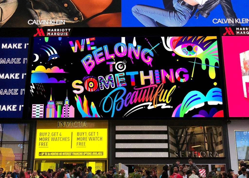
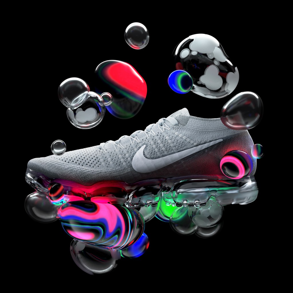
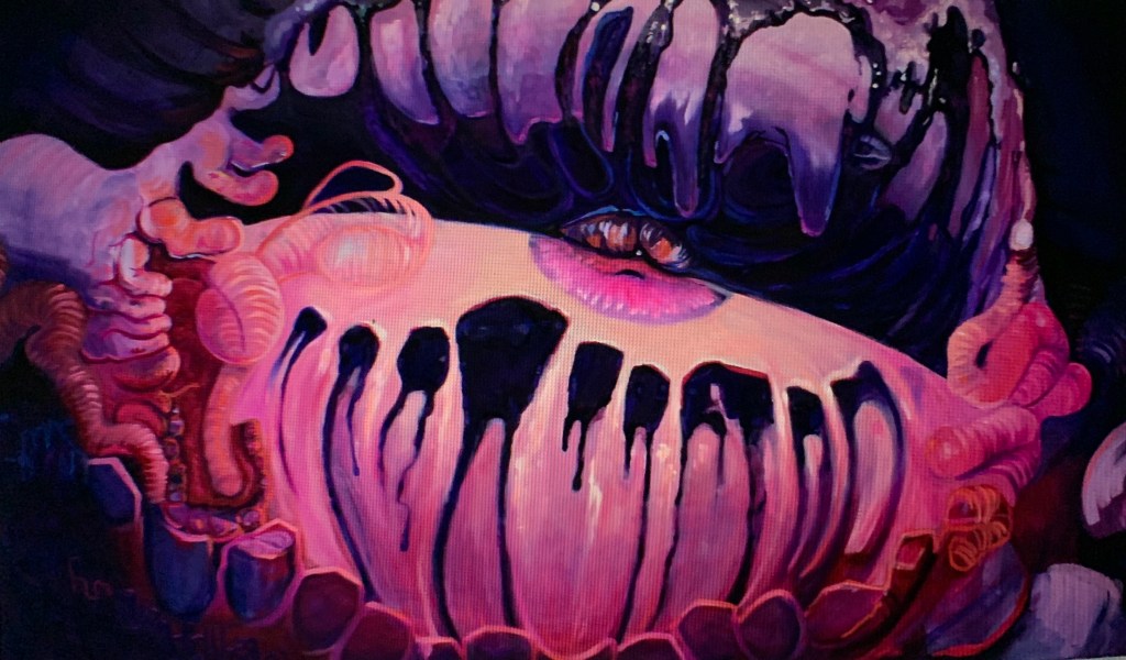
The overall theme of my virtual art gallery is vibrancy. Each of these pieces stands out in their own way based off of the bright and vibrant neon colors used. Not only that but they all have a form of reality in each. For instance, Jason Nash incorporates body parts like facial features and skyscrapers, David McLeod used a collaboration with Nike Vapormax’s as well as used the real shoe with his digital piece, and lastly Pawel Norbert incorporated a lifelike hand in his piece as well. Ultimately I was very intrigued by the cartoonish style of digital art and recently I have been getting more and more involved as well as fascinated by drawing digitally.
We belong to something beautiful by Jason Naylor
Jason Naylor is an award winning artist, designer and creative director based in Brooklyn, New York. He has a Bachelor of Arts in graphic design from Brigham Young University. His overall piece definitely fits the theme of vibrancy. Most of his work is actually much like this. He tends to use bright and vibrant colors over a black contrasting background. He also tends to covey a message in his pieces or make them animated. In this circumstance he did a collaboration/campaign with Sephora, the popular beauty brand. His piece ended up being in countless Sephora stores and even displayed in Time Square, as shown above. I really admire how far he came and his dedication, especially how he really applied himself and eventually collared with a major brand.
Nike Vapormax by David McLeod.
David McLeod is an Australian artist and designer. And on this particular piece with Nike he created a product visual and animation for the release of their VaporMax sneakers. The animation was projection even mapped onto the Centre Pompidou in France as a part of the official launch event held on Air Max Day. Overall his piece is very vibrant and shows off the grey sneaker very well. And in my opinion his color palette has been very well chosen because it doesn’t wash the sneaker out but it makes it clearly stand out with a very creative twist including the bubble like animation. Not only that but I especially like how the bubble like animation reflects its vibrant colors onto the sneaker. It adds to the piece very well.
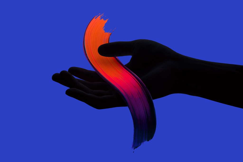
Intentional by Pawel Nolbert
Pawel Nolbert is an image maker and color artist who explores color, expression & visual languages. He also works with brands like Apple, Adidas and Disney, to create strong visual work. This specific piece definitely fits the theme of vibrancy as well as the two previous but it takes on a new perspective. Instead of having the contrast in color be the background Pawel made the arm black and the vibrant colors the stroke of paint and background. Not only that but even though the arm is black you can still see the different features like fingers and the palm. This is very admirable because he took the time to make sure every individual detail was still visible and not washed out. I also admire how his work is very simplistic yet it feels complete at the same time. For instance, if you added anything else to the piece it would become over crowded or off balance. And lastly I really enjoyed how he made the pain stroke seem very realistic yet cartoonish with its vibrant color blends.
Overall these three pieces have opened my eyes to the world of digital art, animation, and graphic design. My whole life I have been very hesitant to incorporate technology within my art pieces because I was scared of change and how I wouldn’t understand the mediums. But these pieces ended up inspiring me that I should at least try because the the outcomes have a beautiful payoff.
Mahsa Soroudi was born in Tehran, Iran and comes from a background of art. Her parents both had interests in art with her father being a painter and she is a graduate from Azad Art and Architecture University in Tehran, Iran 2006. Soroudi gained a BFA in Visual Communications. She immigrated to the US with her husband soon after they got married. While living in the US she managed to create new exhibitions to help her adapt to her new life and inspire other women.
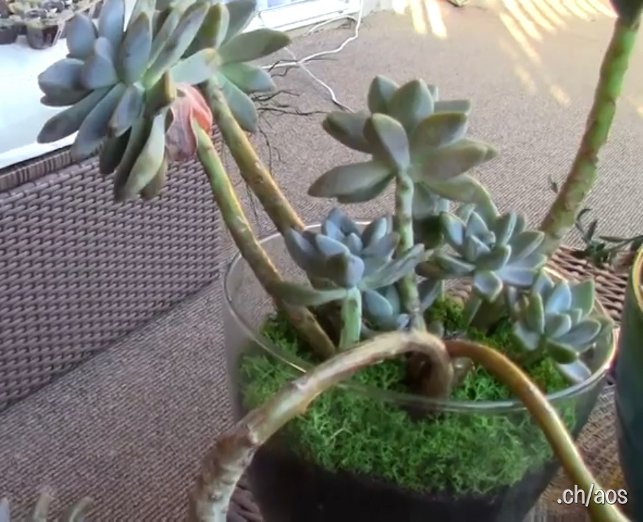
In her piece, Nature’s Cadence, Soroudi does an amazing job of displaying the natural beauty in plants and their replantation. The succulent leaves she planted sprouted gorgeous muted pastel leaves. I was in awe the way they used such little water to regrow into something more beautiful. The representation of the drought of the plants overlapping with the “drought” on her own life added depth behind her piece. As well, the physical style of art also portrays textures rather than more traditional 2D art pieces.
All of her pieces are created with passion for what she does. Her art helps her to feel more welcome and adapt to the new surroundings she had encountered. She has experienced struggles women go through and made her own gallery to showcase Iranian female artists depicting western stereotypes to help them with their own issues in life. She learned that everyone has their own struggles and using art is a good way to bring women together no matter the distance.
This piece has honestly been eyeopening. Her physical live art of growing succulents has showed me that there are so many different ways to express yourself through art. All her pieces are unique to her and all have a deeper meanings. Her gallery filled with Iranian women’s art has inspired me, it doesn’t matter what media is being published art still helps people get through their rough situations and even brings people together.
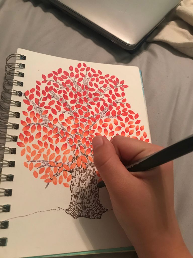
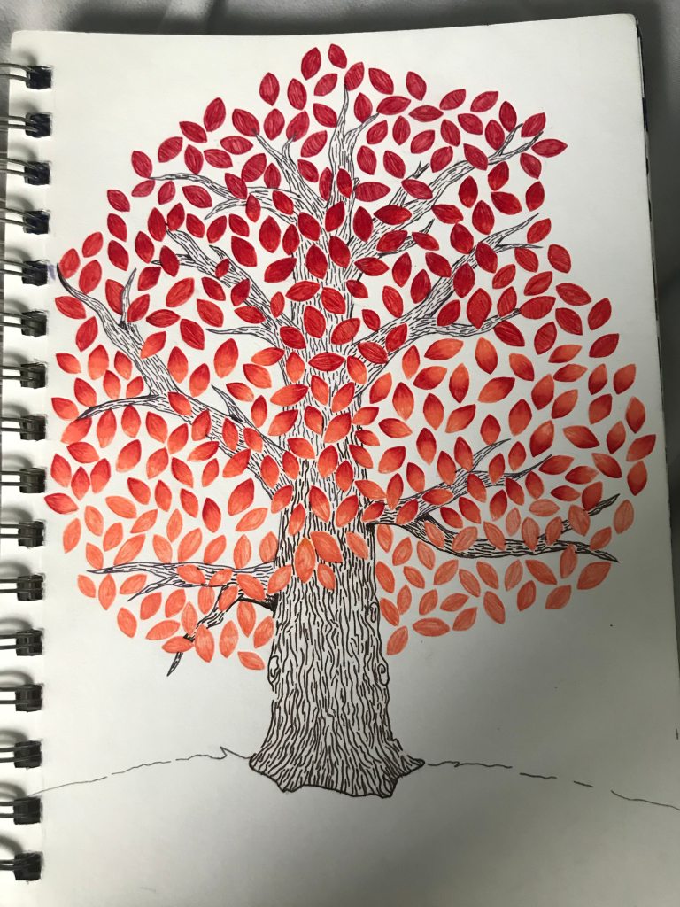
My experience drawing this was very peaceful and fun. I sat outside in my backyard sketching and enjoyed the nice Northern California weather. I ate my lunch, pulled out my sketchbook and lounged with my dogs. The many fruit trees in my backyard ultimately inspired me to draw this piece because they are all blooming for spring. I didn’t want to use traditional greens, so I added a pop of color with warm autumns. Once I finished my lunch I then went to my room to complete the line work.
Overall my piece came out very nice and was a good way to keep me busy during quarantine. The line work I did for texturing the tree was very realistic and it added a real feel to the piece. While the leaves were fun to shade in and I ended up adding an ombre of leaves, so the piece wouldn’t be monochromatic.
My video is about myself explaining the impacts of single parenting on children. My goal was to bring awareness to this very serious issue. I think I accomplished my goal very well, I used real facts and added pictures to help with more visuals. Next time, I would try to memorize what I was saying, but I was a little nervous and kept losing track of my point. I also wish I could have had a better angle but my tripod was acting up, so the angle I recorded me talking was a little weird. I would like to vlog again, but I don’t think I will. I am very busy with work and other school, so I don’t think I will have a lot of time to vlog.
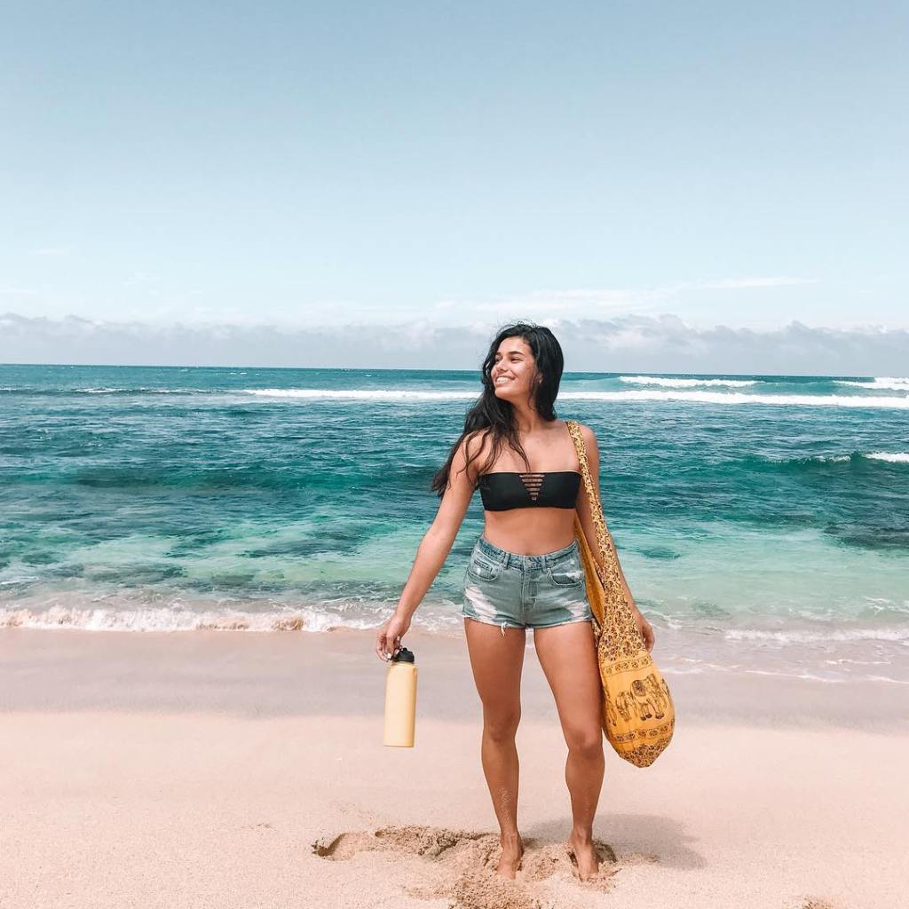
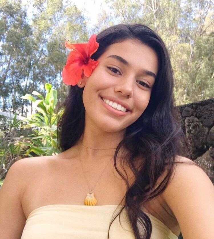
My favorite YouTube is Ava Jules. Her work appeals to me because she is really eco friendly and brings awareness to outstanding issues, especially ones dealing with the ocean. She also only advertises products she actually likes and only eco friendly products. As well, she lives in Hawaii and I love the cinematic shots she records. Her vlogging style is very laid back and she is just herself on camera. I would like to apply her recording style and all the angles she uses to show off the beauty of nature.
Authenticity to me is originality and just being yourself. On the other hand performance is putting on a show or acting. Authenticity and performance are usually opposites, most of the time people who are preforming are not acting like themselves and are pretending to be something that they are not. But, in some occasions people, like some youtubers, can still be themselves while recording and perform without losing sight of who they actually are.
I think both are authentic, but I believe the live audience one is a little more of a performance. The live audience one they seem to try to be a little more entertaining and are constantly focusing on the audience. While, the at home clip they seem more invested in the interview rather than acting different to entertain the audience.
This past Wednesday while attending our Art 110 class a local Artist named Sienna Brown came and presented her work, “Product of the Pallete”.
Sienna Browne is graduate student at California State University, Long Beach. She is majoring in Drawing and painting while balancing being a beach lifeguard, middle school youth leader at Rock Harbor Church and Instructional Student Assistant for the art department at Long Beach State. Not only that but Sienna has been in love with art since she picked up a crayon.
Nevertheless, her piece “Ice Cream Dream” was absolutely beautiful. The color palette especially amazed me. The combination of the dark purples/blues with the light pastel pinks really creates great contrast in the piece and gives the piece some depth. Not only that but the blended line work is also amazing. As well as the shape and shading, it makes the piece look so round and 3D.
All in all her pieces are a reflection of her life experiences. She uses her passion of art to work through obstacles in her past by facing and re-experiencing past pain. All the social pressures, bullying, perfectionism eating disorders, the exclusion throughout middle and high school, the death of her father all were factors that were put into her pieces. She learned that creativity was the only way to get through the struggles she had and how it all in all had healing properties.
Overall my experience with this piece has only been pleasant. It has inspired me to branch out into other medias especially paint because I have only used watercolor and acrylic paints. I would really like to experience oil painting and how well they blend compared to others. All in all her pieces have been absolutely beautiful and inspire me to continue my art journey even though I have been discouraged many times before hand.
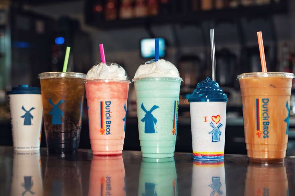
this is what “coffees” about [reference to name that doesn’t fully describe the other drinks]
I can’t “
While writing my song I was thinking about how much I missed and love Dutch Bros Coffee. Back home I was so used to having it everyday that when I moved to Long Beach I was super sad.
Writing my song took time. I had to look at the menu a few times to get everything to sound decent.
Other than constantly looking at the menu the process wasn’t that challenging. Oh, also trying to thing of rhymes too. That part was probably the difficult.
Overall I think my song is semi successful. Like it’s not horrible but its nothing that can go viral.
When asked if I would write another song in the future my answer would probably be no. There’s too much thought that has to go into it.
If I did end up writing another song I would probably write something about my upbringing like all the rappers nowadays.